Intro
Research
Ideation
Final Design
Outcome
Stabil Stockholm Project
Intro

Boosting Stabil’s Conversions by 20%


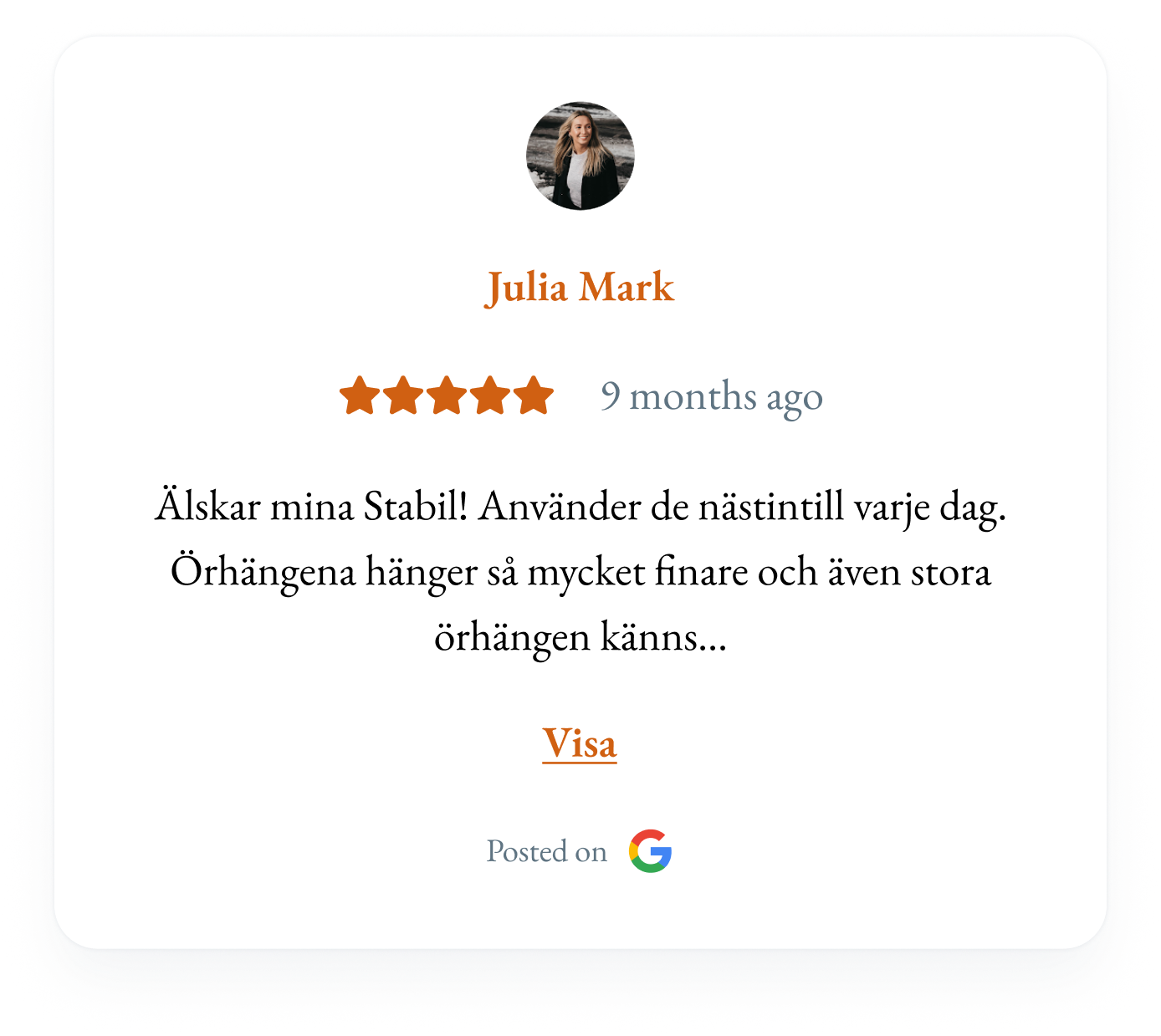
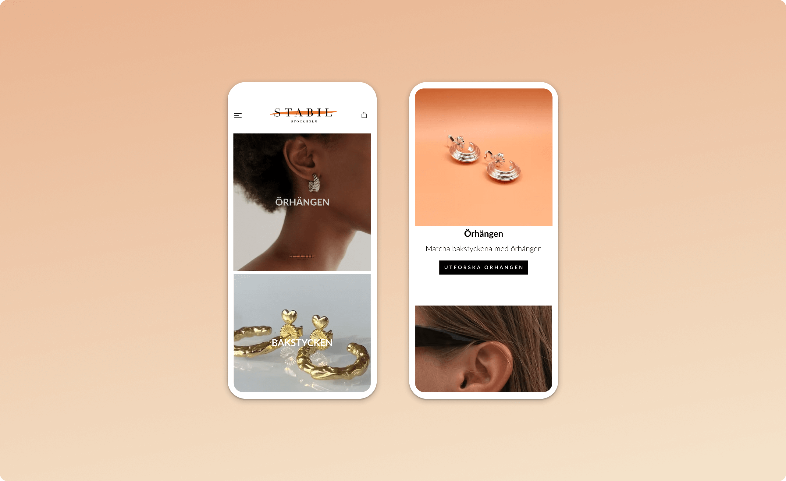
Stabil shoppers lacked confidence before purchase. I identified barriers around product confidence and trust, then redesigned the shopping experience

ROLE:

UX Designer

TEAM:

5 Engineers and 1 PM/CEO

TIME:

3 months

GOAL:

Increase Conversion

TLDR

My role

I led UX from research and problem framing to redesign, user validation and post-launch metrics.

Key decision

Instead of optimizing checkout, we focused on product discovery, where users lacked clarity, trust, and confidence.

Outcome

The redesign increased conversion by 20% through clearer products, stronger trust signals, and better ad-to-page alignment.

Research

Uncovering User Pain Points

Analytics and usability testing showed the barrier happened before checkout, shoppers lacked confidence during product discovery. Therefore I prioritized product clarity and trust over checkout optimization. Here’s what I found:


Description of the image
A short summary of some of the major findings


Key Takeaways

1. “Am I in the right place?”

Users felt disconnected when the landing page did not match the ad they clicked.

2. “Why should I buy?”

Users struggled to understand what Stabil sold and what made the product unique.

3. “Can I trust this brand?”

The site felt cluttered and unpolished, reducing trust before purchase.

Ideation

Turning Research Into Decisions

After 10 usability tests and 6 user interviews, I aligned with stakeholders and developers on the key barriers, design priorities, and what was feasible within platform constraints.

Tradeoffs

Checkout vs. discovery

Checkout was tempting to optimize, but the real drop-off happened earlier so we prioritized that.

Ideal experience vs. platform limits

A better experience was possible, but the website platform limited what we could change. We prioritized the highest-impact feasible improvements.

System quality vs. resources

A full design system would improve consistency, but we lacked the resources. We focused on the website as a foundation for future design work.

Ideation

1. Is this the Right Place?

Users felt a disconnect between the Instagram ad and landing page. I restructured the page to better match their expectations.


Description of the image
Before to the Left and After to the Right


2. Why should I buy?

Users struggled to understand Stabil’s value. I placed USPs closer to product categories to make the benefits easier to see while browsing.


Description of the image
Pushing the USPs of the product


3. Low Trust

Users perceived the site as cluttered and less trustworthy. I simplified the UI, improved consistency, and added reviews. Follow-up testing: 5/5 users described the redesign as trustworthy.


Description of the image
Before to the Left and After to the Right
Description of the image
I also added a Review part to increase Social Proof
Final Design

Bringing It All Together

This is the final design that got implemented


Video of the landing page of the Final Design
Outcome

From Insights to Impact

The redesign increased conversion by 20% and improved user confidence in follow-up testing. Users described the new experience as clearer, more professional, and easier to navigate.

Learnings

This reinforced how early developer collaboration helps protect the user experience while navigating platform constraints.

Previous Project
Next Project