Intro
Research
Ideation
Final Design
Outcome
Stabil Stockholm Project
Intro

Increase GetQsic's User Engagement by 16%


GetQsic provides music streaming services using an analytical model to enhance customer moods and drive sales. I conducted a UX audit on their website.

ROLE:

Solo UX Designer

TEAM:

2 Engineers, 1 PM and 1 CEO

DELIVERABLES:

Redesigned website on both Desktop and Mobile

TIME:

1 month

GOAL:

Increase User Engagement

Tools

Logo 1
Logo 2
Research

Journey to Success

I chose to focus on Google Analytics and competitor analysis due to time constraints. These methods provided quick, actionable insights without the need for time-consuming user recruitment

Analyze & Recruit:

Through Google Analytics I gathered some insights on initial designs, such as simplifying navigation and enhancing CTA visibility.

Test & Iterate:

Overcame time constraints by prioritizing high-impact features and leveraging rapid prototyping techniques.

Implement:

Although not involved in final implementation, I maintained regular communication with engineers and the PM throughout the design process, ensuring feasibility and alignment with business goals.

Research

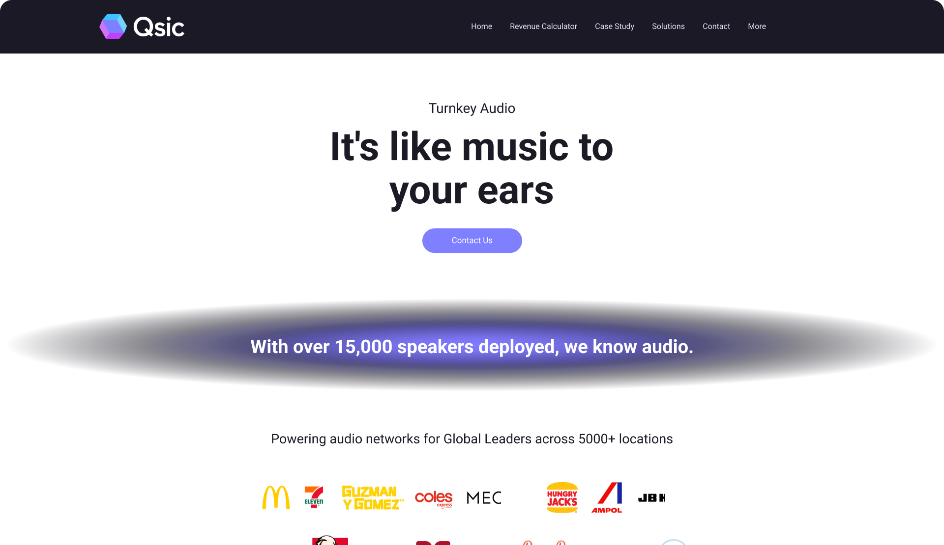
Current Design

Pictures of an Old App

The app UI was really outdated


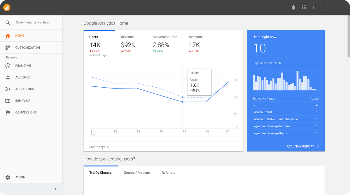
Google Analytics

The analytics gave me insights to where the users dropped off and what parts they engaged with.

Description of the image
Analytics mockup


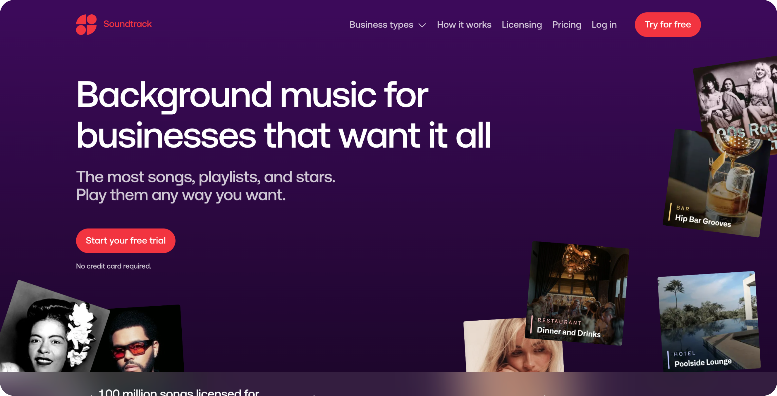
Competitor Analysis

I took a good amount of time to investigate competitors style and structure.

Description of the image
Competitors UI
Ideation

Time for action

Given the one-month timeline, I leveraged Google Analytics and competitor analysis for data-driven decisions. I focused on high-impact areas like:

Design System:

This was to make sure that the design was consistent and accessible throughout the website and so that they could expand upon the design.


Aesthetic

I wanted to make sure that the brand was cohesive and that the website was conceived as professional.


SEO Optimized

Increase searchability, obvious CTAs, clear USPs and more to make the user engage as much as possible.

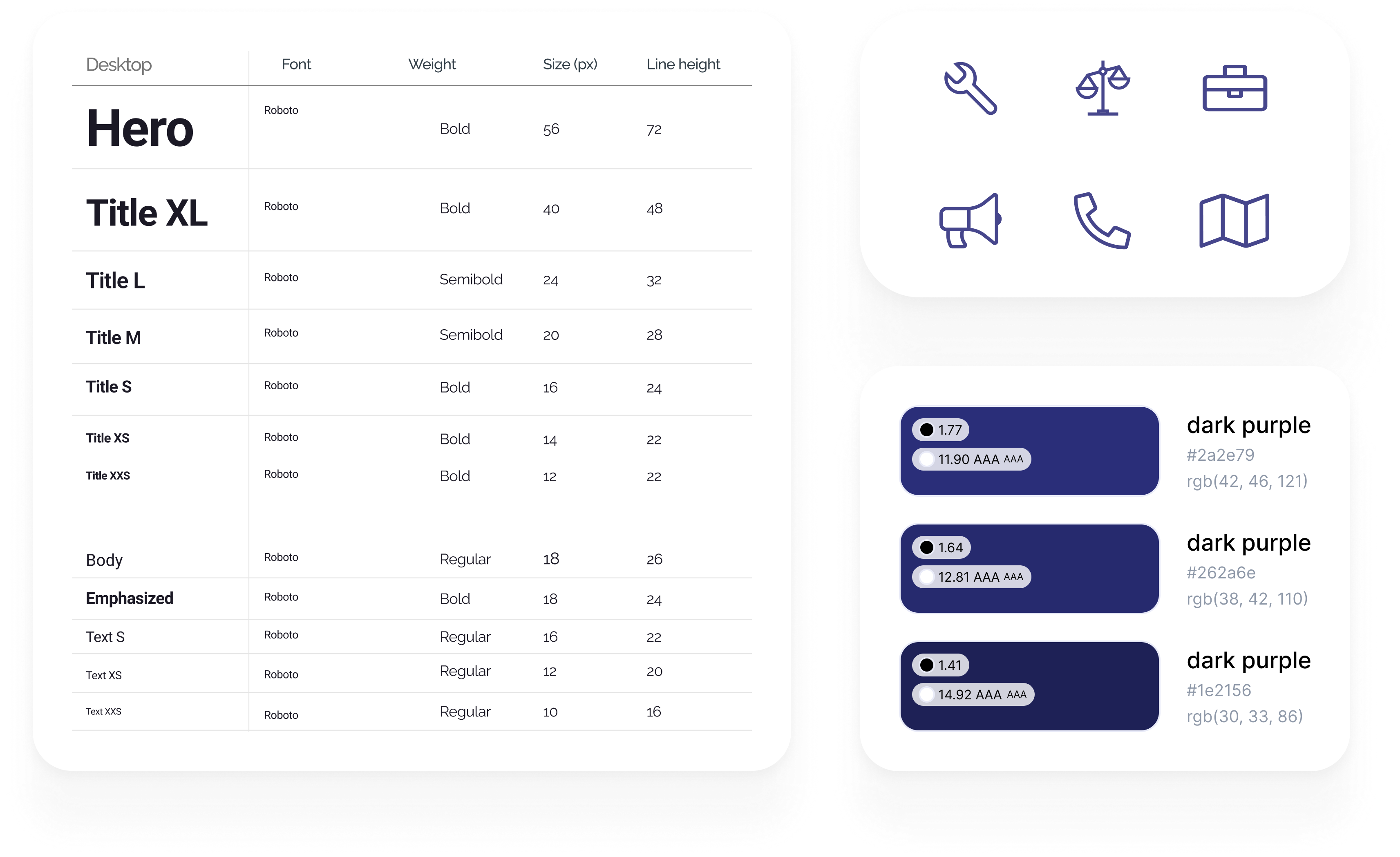
1. Design System:

This was ongoing during the whole project but we finished with 50+ components with many variables and a rigid structure in Figma.


Description of the image
Some parts of the Design System


2. Look and Feel:

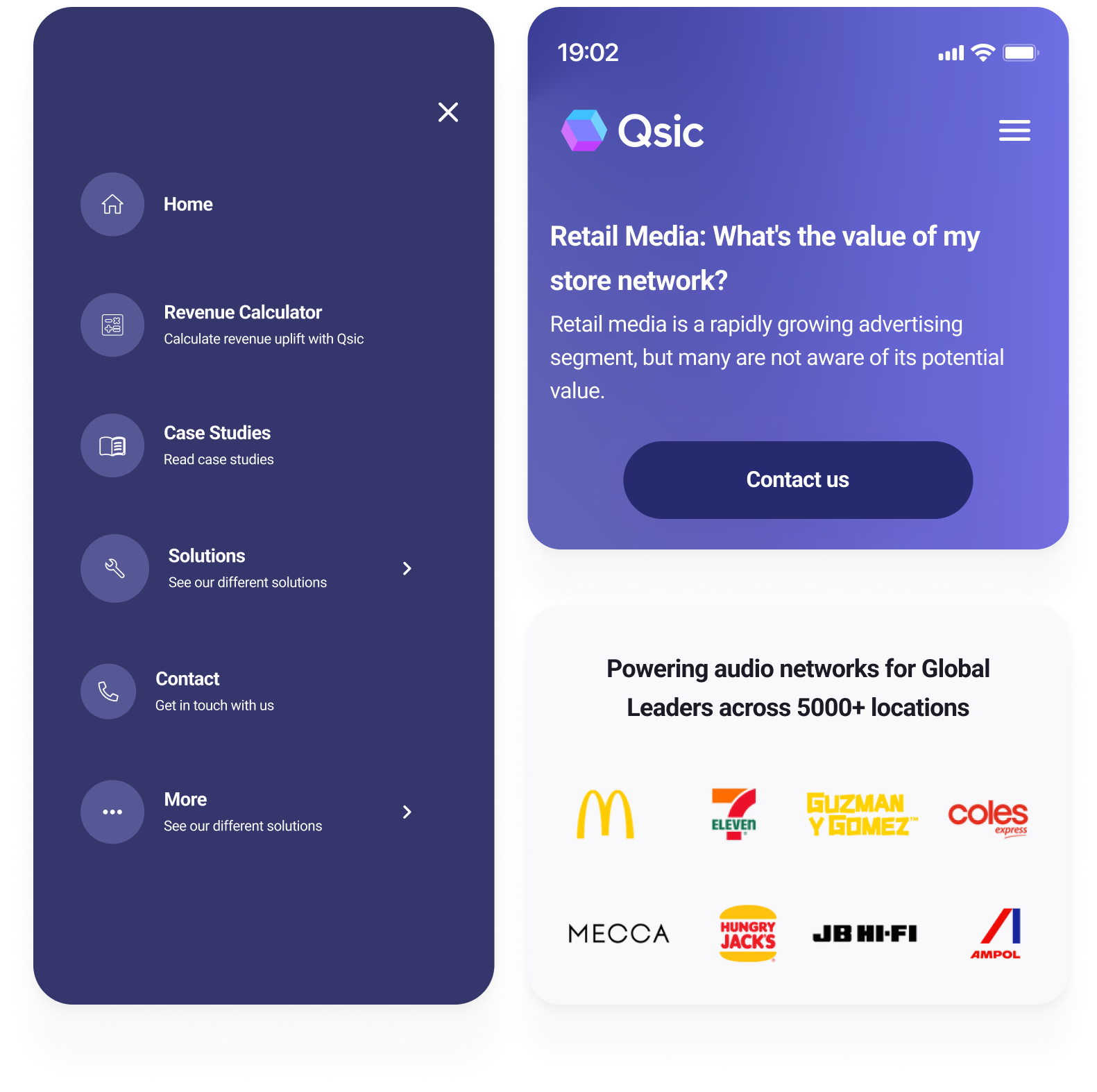
As I saw that we had a lot of Mobile traffic I designed Mobile first to make sure that the aesthetics worked across all devices.

Description of the image
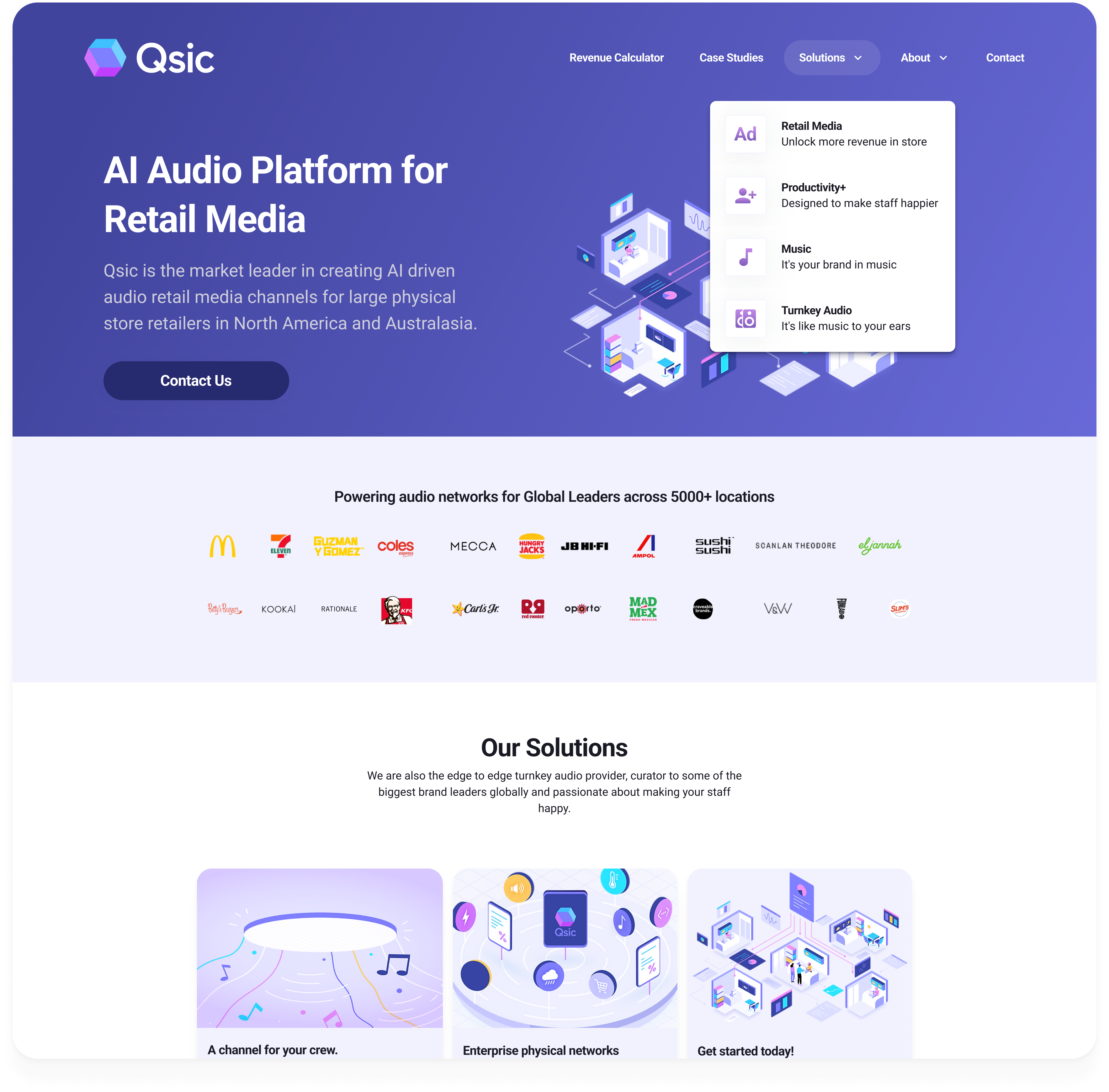
Snapshot of UI


3. Making the site easy to digest:

Updated navigation, clear CTAs and a compelling copy.

Description of the image
Navigational improvements, Copy and Social Proof
Final Design

Bringing It All Together

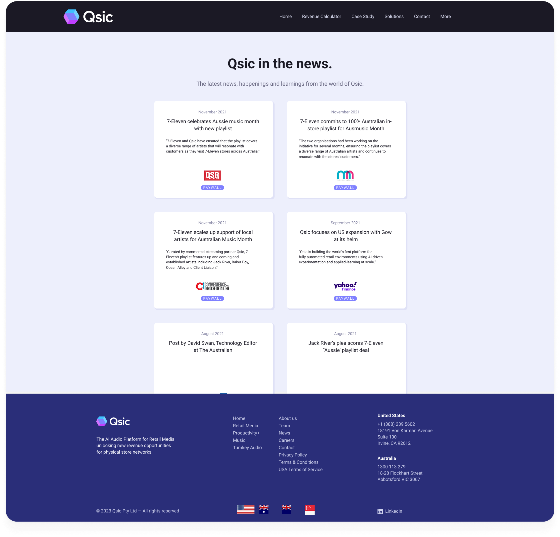
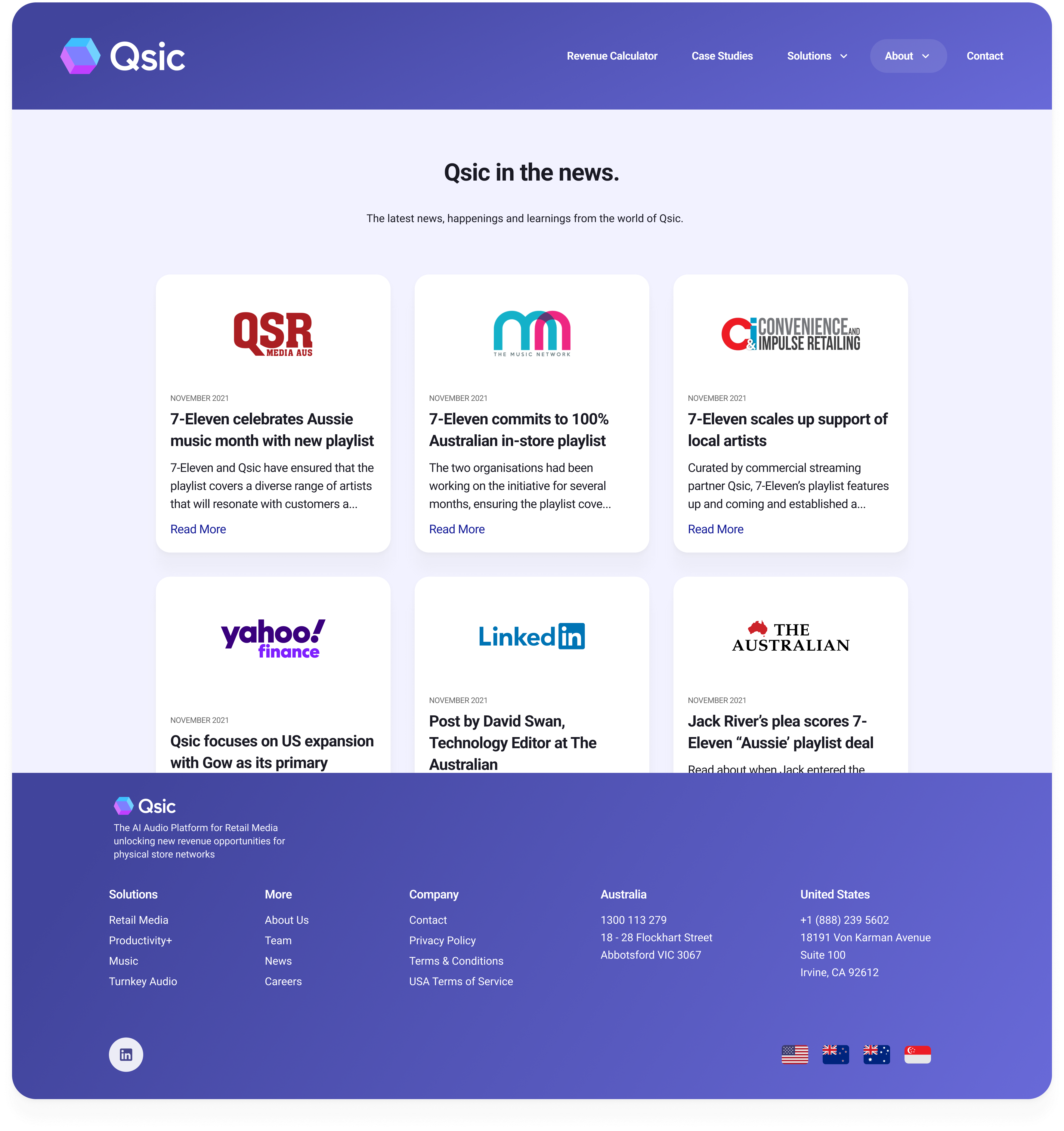
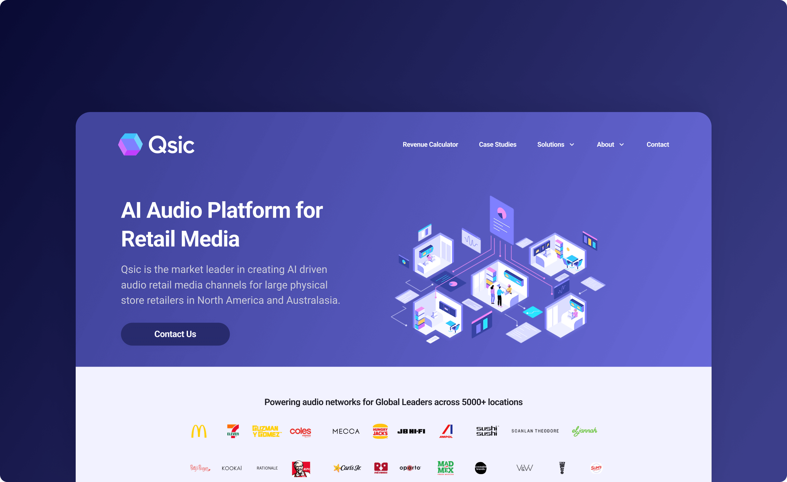
The final design is a culmination of the previous steps. It's a clean, modern, and user-friendly interface that effectively communicates the brand's message and values.


Description of the image
Old Screen of the News Page


Description of the image
New Screen of the News Page


Description of the image
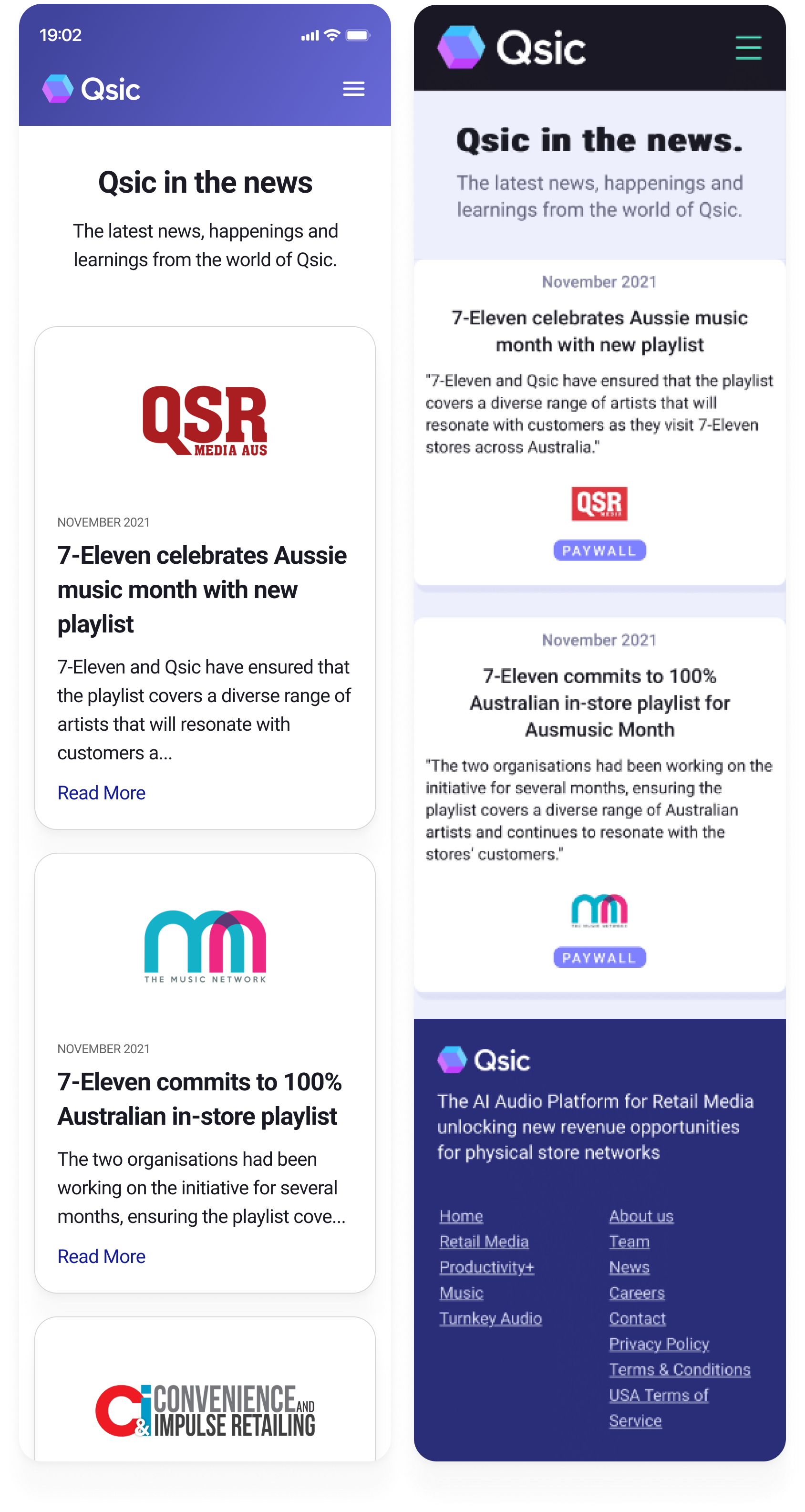
New Mobile News and Old Mobile News
Outcome

From Insights to Impact

16% increase in user engagement was a great win for the Getqsic team. The new design effectively communicated the brand's message and values, leading to a more cohesive and user-friendly experience.

Learnings

This project taught me the value of rapid prototyping and data-driven decision making under tight constraints. In future projects, I'll prioritize establishing clear metrics early and maintaining stakeholder alignment throughout the process.

Previous Previous Project
Next Project Next