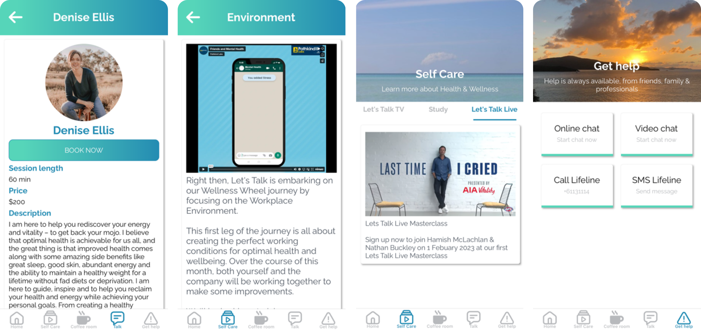
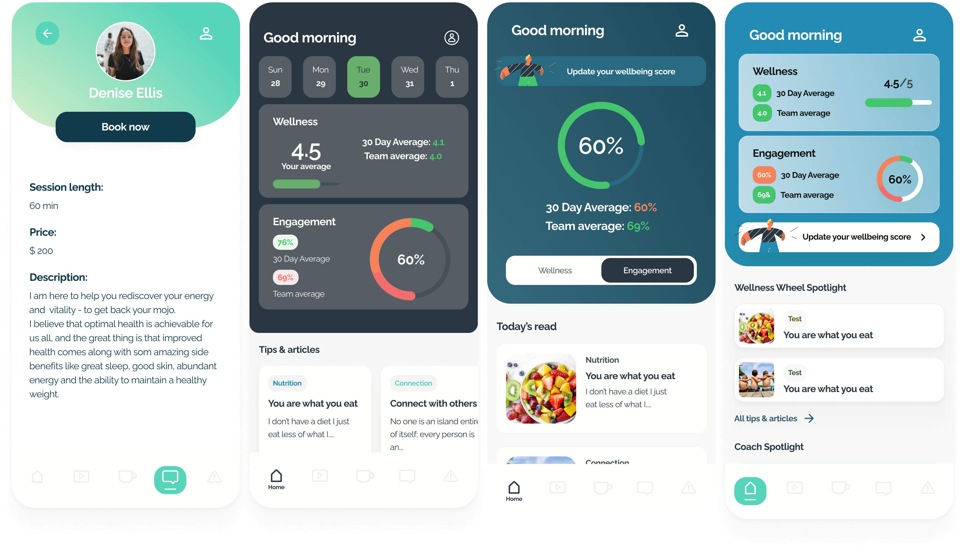
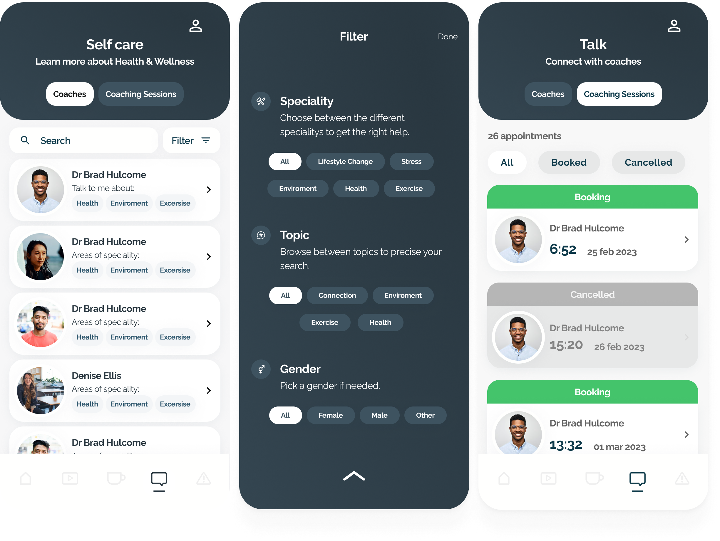
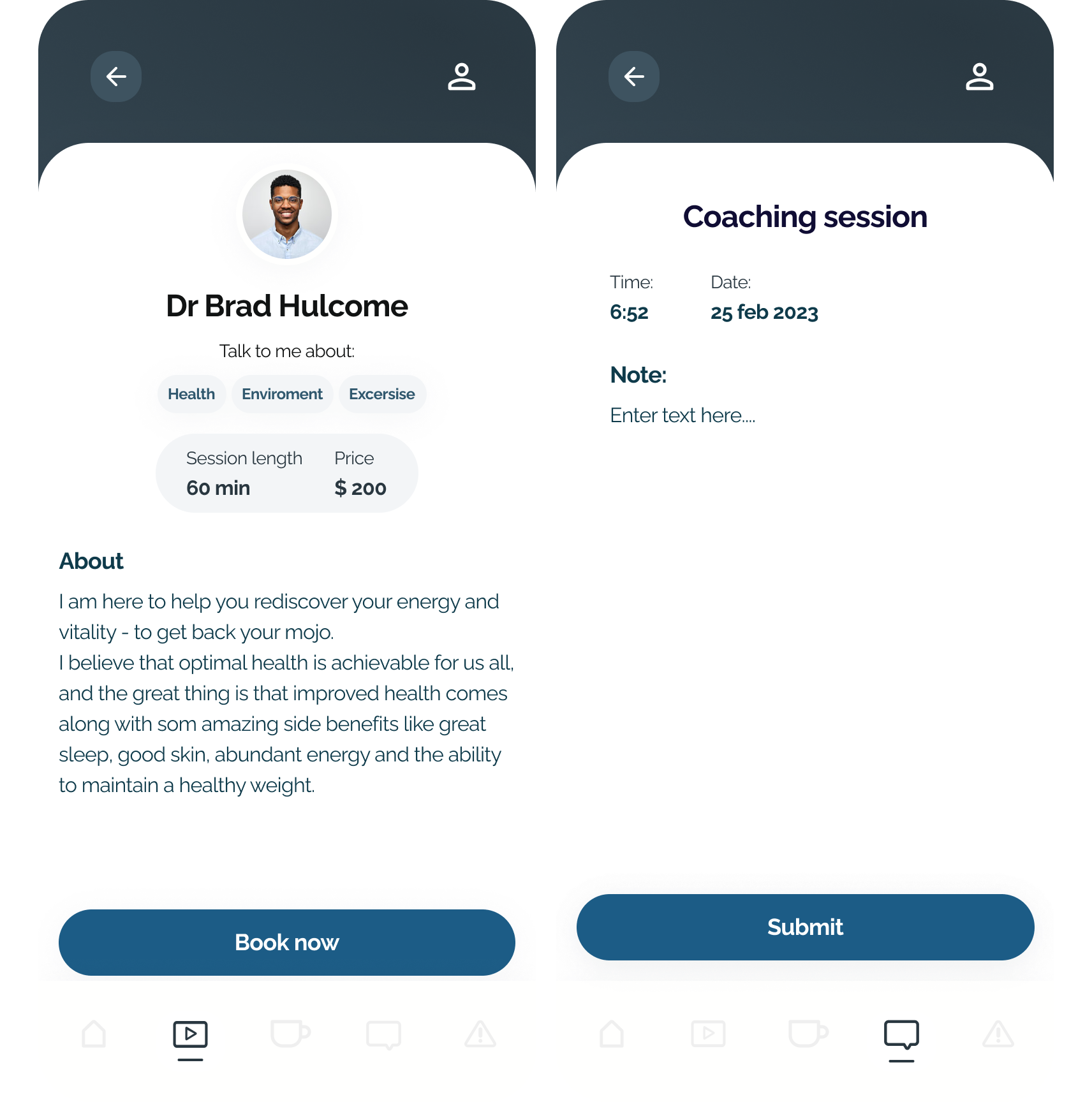
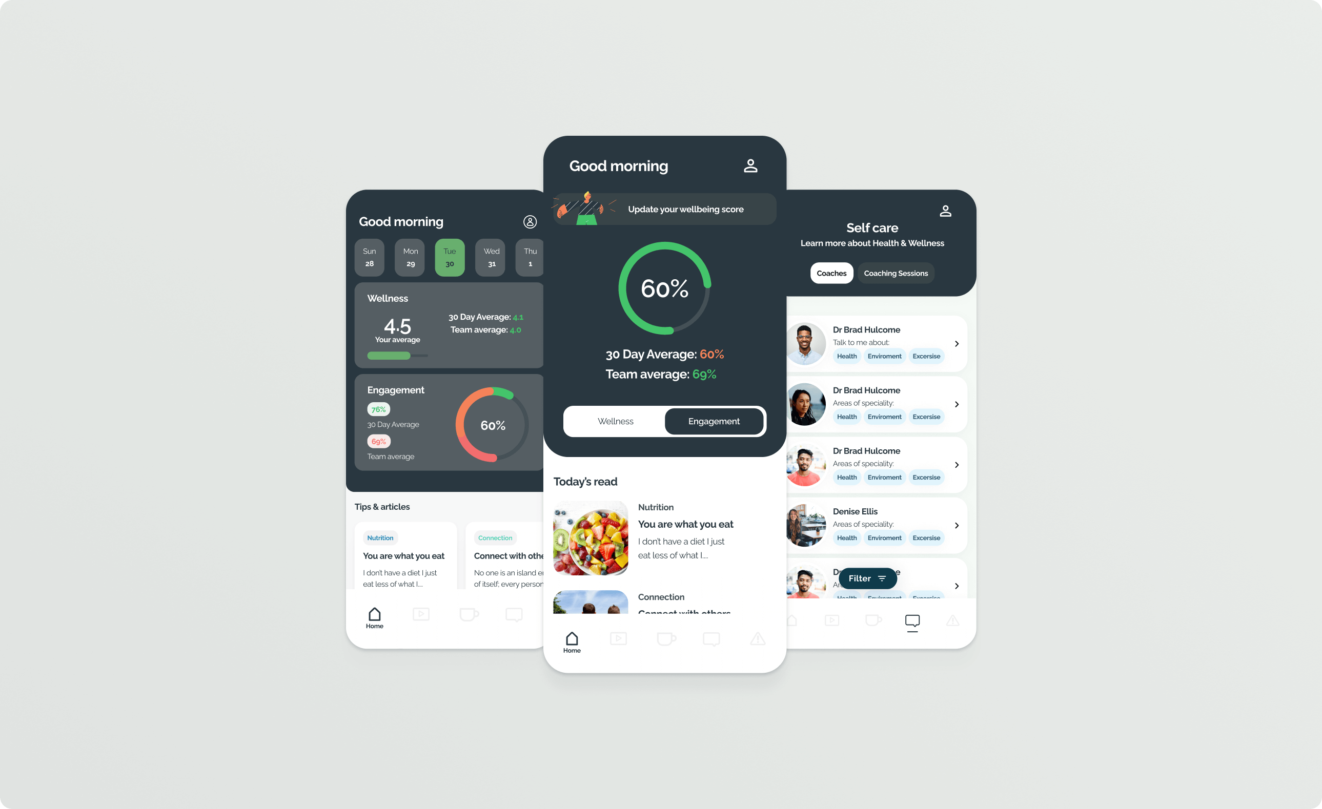
Led the redesign of Let's Talk app that is a Health and Wellness solution in Australia that resulted in a 32% Increase in User Engagement
UX Designer in a two-designer team
2 Teams of Engineers, 2 PMs and a CEO
4 months
Increase User Engagement by at least 15%
I worked in a two-designer team and helped lead the UX work from research and problem framing to redesigning the core mobile experience.
Instead of adding more features, we focused on making the existing experience easier to navigate, more modern, and better aligned with the features users actually wanted to revisit.
The redesign increased user engagement by 32% by improving navigation, refreshing the UI, and reducing feature overload.
With limited prior research, I focused on identifying key issues through stakeholder interviews,
competitor analysis, and usability studies.
To investigate the current problems I conducted Stakeholder interviews, Competitor Analysis, Affinity Diagrams, Usability Studies and more.
Executed user research to verify hypotheses and acquire insights. Improved design elements based on the feedback received during usability testing.
Collaborated closely with engineers to ensure design feasibility, and with PMs to align on product roadmap and business objectives.
Many wellness apps prioritize aesthetics and simplicity, enhancing user appreciation and reinforcing functionality.
User interviews revealed that many felt the design was outdated.
Usability Studies found out that the current navigation was very hard to deal with
Usability Studies showed that the app had a lot more features than the users did know of
I prioritized solutions based on user pain points and technical feasibility, balancing user needs with business goals that User Research led to these key challenges:
The app had many features, but users struggled to find and understand them. We prioritized clearer navigation and surfaced the most valuable features instead of adding more complexity.
Users felt the app looked outdated, but the redesign still needed to feel familiar enough for existing users. We modernized the interface while keeping the core experience recognizable.
Stakeholders wanted to highlight more of the product, while research showed users needed less noise and clearer paths. We focused on the areas most likely to increase repeat engagement.
As users thought the design was outdated I had to balance the CEO's desire for a colorful app with user preferences for simplicity.
As the research suggested that it was hard to navigate I Iteratively refined the navigational structure after each round of user testing to make sure that I picked the right solution.
As the research suggested that there was only a few Features users actually used we trimmed the others ones down and refined the ones that was being used.
For the Final Design:
- Improved Findability
- Improved Information Architecture
- Improved Visual Hierarchy
- Improved Visual Identity
An Increase in User Engagement of 32%
was really fun to see, unfortunately I didn't have time to measure it after more than 1 month afterwards.
But through this project, I learned how to cooperate with two different visions about the project and aligning
the team on these and to try to navigate through that landscape.
This project taught me the importance of balancing stakeholder desires with user needs. In future projects, I plan to involve stakeholders in user testing sessions to build empathy and alignment earlier in the process.